Eleanor Oldham, Senior Geophysicist
Pressure plots are a useful tool for de-risking column heights in hydrocarbon accumulations (this will be elaborated on in my next article) as well as for screening top-seal integrity of potential CCUS sites. But how can you use them to extract the information you need?

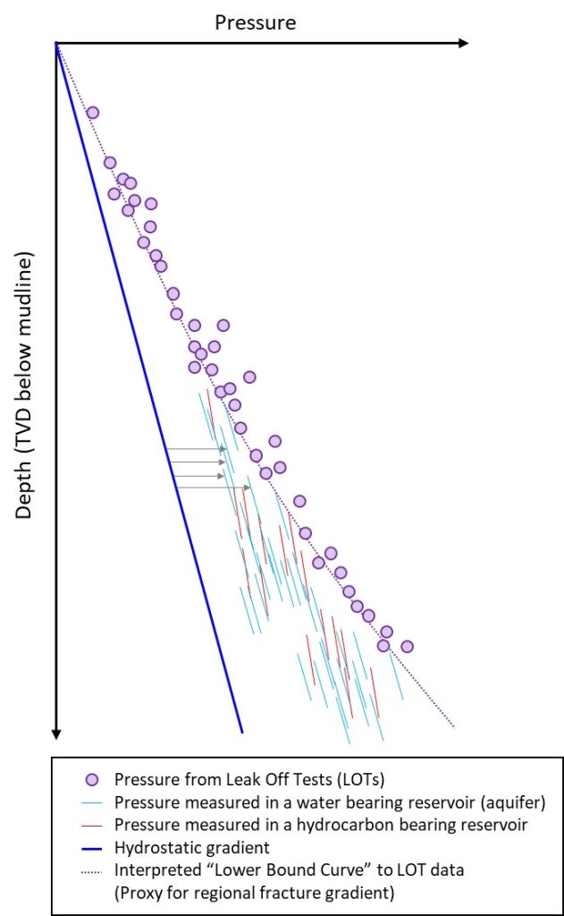
Above is a cartoon of a pressure plot of a regional database. The solid dark-blue line represents the regional hydrostatic gradient (which is normally pressured). The thin blue and red lines represent groups of pressure samples from a variety of water and hydrocarbon bearing reservoirs. They all overlay each other in a confusing way! This is because each reservoir in the data cloud is experiencing a different amount of overpressure.
The grey arrows show how we can measure overpressure in four of the water-bearing reservoirs: It’s just the pressure offset between the local aquifer gradient and the regional hydrostatic gradient. How can we tell which points belong to an aquifer gradient? Because they have the same slope as the regional hydrostatic gradient (and because I have handily coloured them blue). This is a nice, simple cartoon, but be aware that salinity can slightly alter aquifer gradients.
The red lines represent pressure samples taken from hydrocarbon bearing reservoirs (let’s assume there is just one hydrocarbon phase). We can tell these samples are from hydrocarbon zones because they follow a steeper slope than the hydrostatic (and aquifer) gradient. In an ideal world, we would be able to measure both hydrocarbon and aquifer gradients for each reservoir, however, often wells only encountered one or the other. This is frustrating if you want to measure overpressure but only have pressure samples from the hydrocarbon leg… But more on this in the next article.
The purple points on the plot represent pressures measured by Leak off Tests (LOTs). These tests pump up the pressure in a formation until it begins to fracture. They therefore tell you about the pressure at which a cap-rock will mechanically fail. Unfortunately, LOTs are only able to measure the fracture pressure at a very specific location – at the borehole. As we all know, geology in the real world is pretty variable, and that is one reason why the LOTs give us a cloud of fracture pressures rather than one neat gradient. Other complicating factors are that you may have LOT data from more than one cap-rock and (as usual) data quality.
To get a high-level estimate of a regional fracture gradient, you can draw a polynomial skirting the lower bound of the LOT data cloud. This “Lower Bound Curve” (LBC) can be used as a proxy to the regional fracture gradient. The LBC gives you something conservative to work with if you’re trying to estimate the fracture pressure of a new prospect for which you don’t have local LOT data.
I’ll elaborate on how to use pressure plots to de-risk column heights in hydrocarbon accumulations in my next article.
Here’s a recap of what we’ve learnt so far:
- Aquifer gradients plot parallel to the regional hydrostatic gradient.
- The amount of shift between an aquifer gradient and the hydrostatic gradient tells you how overpressured the reservoir is.
- Hydrocarbon gradients have a steeper slope than the hydrostatic (and aquifer) gradient.
- Leak off Tests (LOTs) tell you the fracture pressure of the cap-rock but are a very localised measurement.
- A high-level estimate for a conservative regional fracture gradient can be created by drawing a polynomial which skirts the lower bound of the LOT data. We call this the “Lower Bound Curve” (or LBC).


